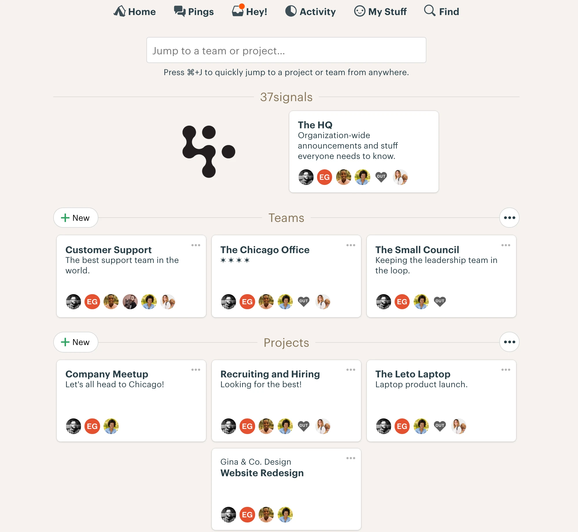
I joined Basecamp as a product designer in 2011, and stayed there for about a decade, eventually becoming head of design at the company.
At Basecamp, designers are generalists who build their own interfaces with HTML/CSS/JS in Rails. Over the years, most of my work was equal parts programming and visual design.
Here's a (woefully incomplete) sampling of a few favorite Basecamp-the-app projects.
Basecamp 2
(2011-2015)
I joined the company in the midst of building the second version of Basecamp, which was a ground-up rewrite. I worked on a range of new UI concepts that became iconic in our subsequent products. A few of those…
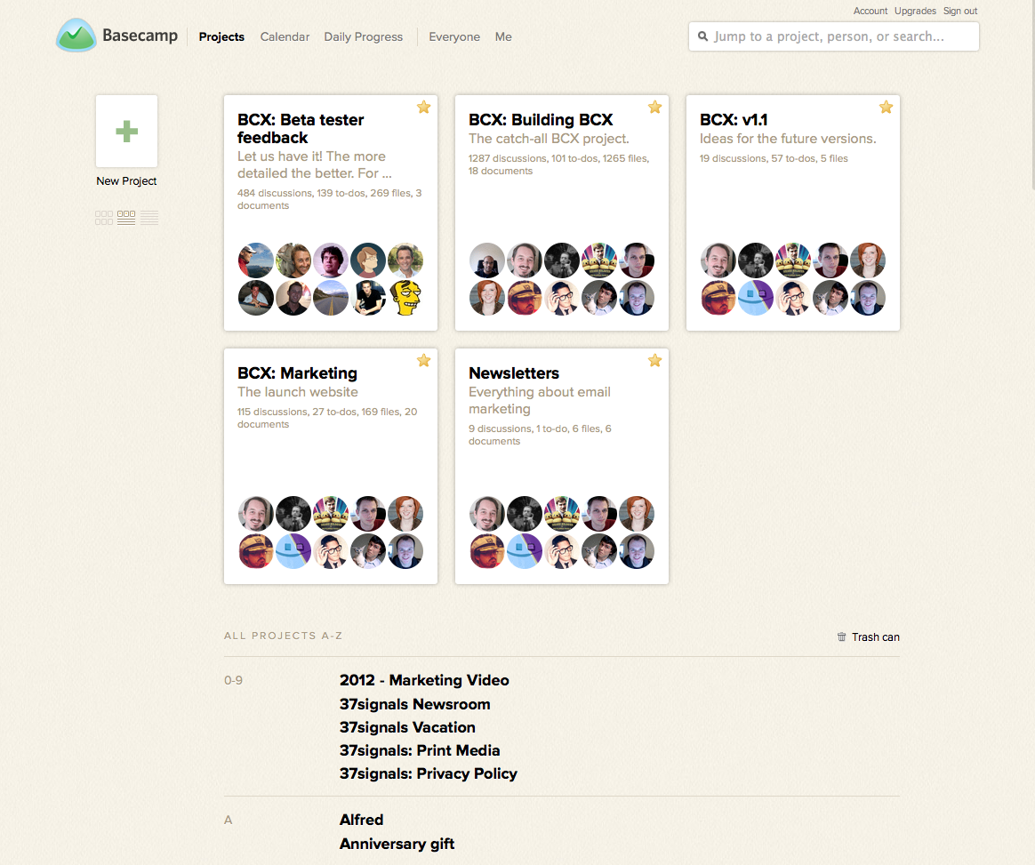
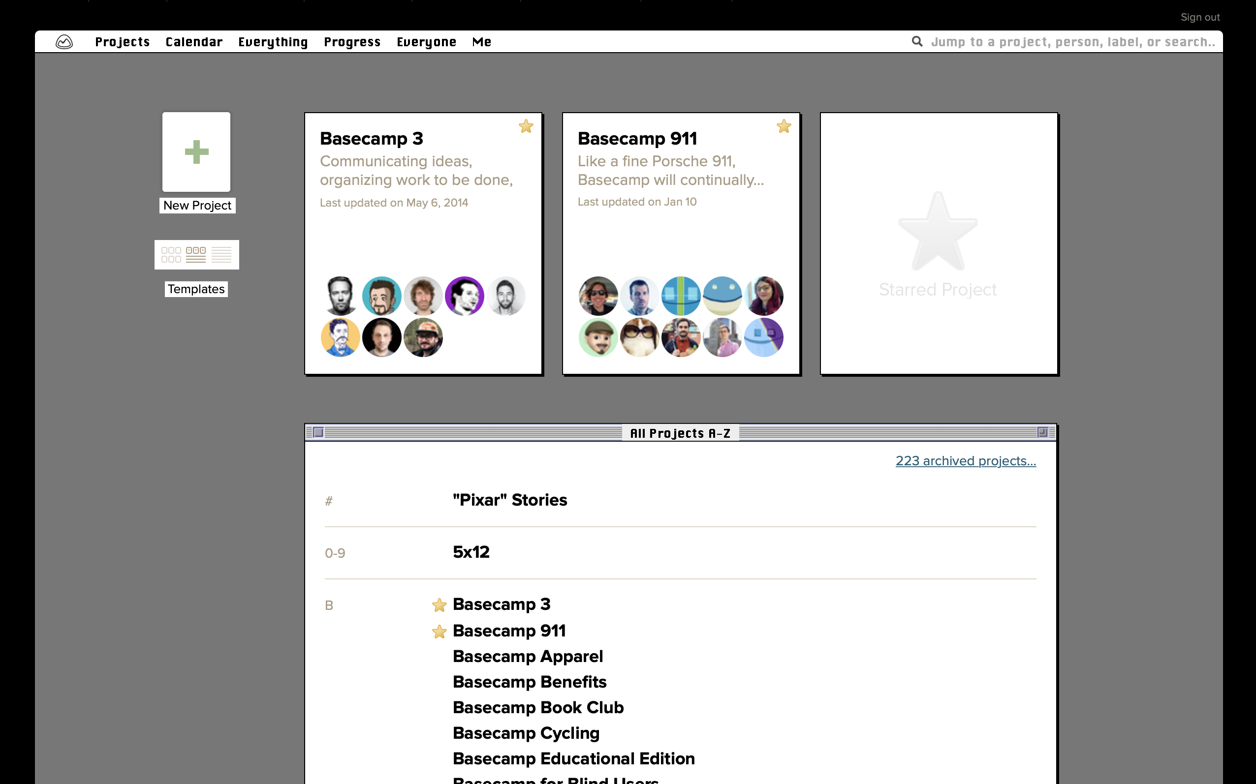
The home screen
In BC2 we started using shapes as metaphors. These cards represented miniature projects, which looked like sheets of paper.
People
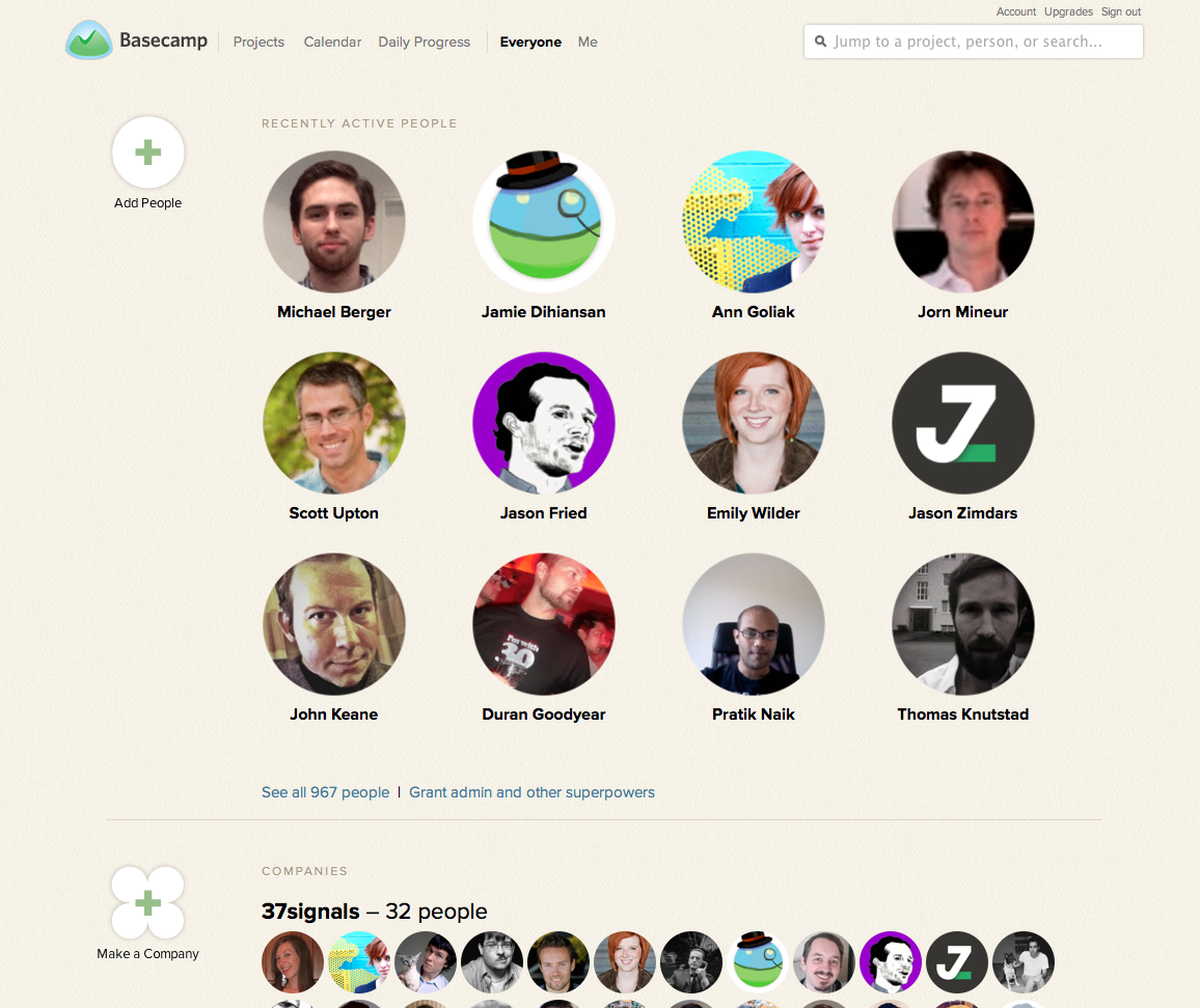
Since projects were rectangles, people were circles, and companies were clovers. (This was long enough ago that round avatars were sort of new!)
Progress
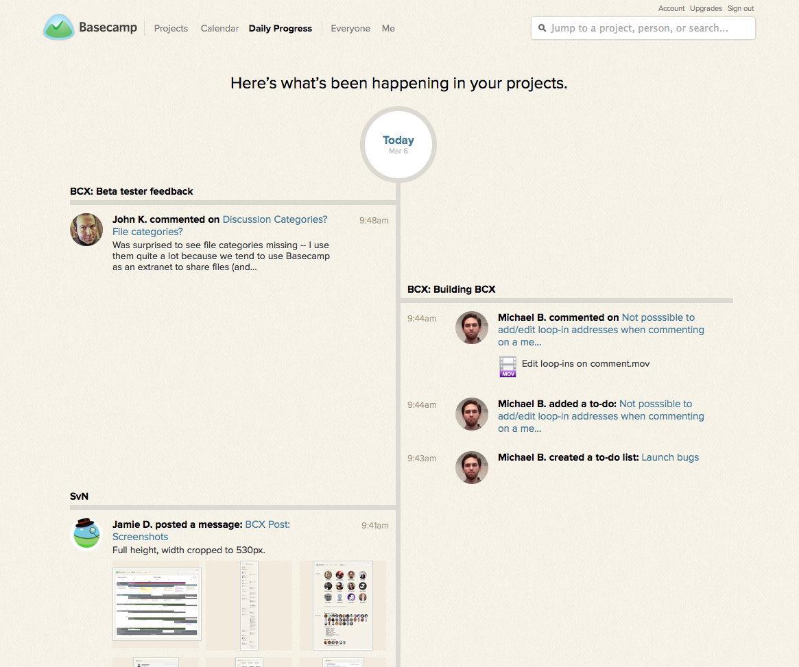
We made an alternating timeline design for the Progress view. This concept has found its way into every product since.
Classic Mac Mode
My favorite BC2 project is a secret easter egg. Kind of amazed we shipped this. Type "dogcow" to unlock it.
Basecamp 3
(2016-2018)
I helped prototype several early ideas for Basecamp 3 before it existed, but I wasn’t involved during its initial development period, because I stayed behind working on Basecamp 2.
After launch, I showed up fashionably late, and helped build the Home screen, then shored up the entire UI with a cohesive visual refresh of the many dozens of screens in the app. We got that done in about 8 weeks with just two people primarily working on it.
My other favorite Basecamp 3 project is Boosts: a unique take on the Likes/Reactions patterns that have infiltrated just about every software platform on Earth.

I also spent a year on onboarding and conversion improvements for Basecamp 3. We ran a battery of A/B tests to verify a range of design ideas around signup and account setup.
We improved our conversion rates, but more importantly, made signup a much better experience. More on that in this post.
Design leadership
In 2019 I started managing Basecamp’s design team of 6 people. Most of the people on the team had been at the company for a long time — some for longer than me. Stepping into a leadership role like that is a humbling experience.
My role was mainly supportive and tactical: helping the team overcome challenges, advocating for them, and encouraging & moving us forward.
Some of that work involved…
- Maintaining regular 1:1s and team meetings.
- Creating new spaces for collaboration and discussion.
- Hiring new people on the team.
- Performance reviews and feedback.
- Improving documentation and definitions for how we were structured and leveled.
- Coordinating projects and giving feedback on UI, code, copywriting, etc.
- Communicating strategy and product direction.
- Implementing new processes for quality control and reactive work.
Related links: