The special recipe for delight
June 3, 2015
June 3, 2015
Delight is a word interaction designers have been throwing around for the past couple of years. Some people think it’s an overblown buzzword, while others believe it’s a subject worthy of an entire conference.
One part of “designing delight” is about turning otherwise mundane tasks into funny or interesting moments. On the UI side, this might include adding thoughtful animations, cutesy or clever copywriting, and perhaps tossing in a few surprises on top.
These surface-level treatments help make a product seem more human and less computery, which is surely a good thing to do. But there’s another, deeper kind of delight. For this post I’ll call it DELIGHT. Here’s an example.
I recently moved my sizable photo library to Google Photos, for a variety of boring reasons: it syncs with Google Drive, storage space is generous, sharing albums is easy, it doesn’t mess with my existing file structure, and searching is miles ahead of competing services. Sure enough, it all works very well — currently besting Apple’s or Dropbox’s offerings.
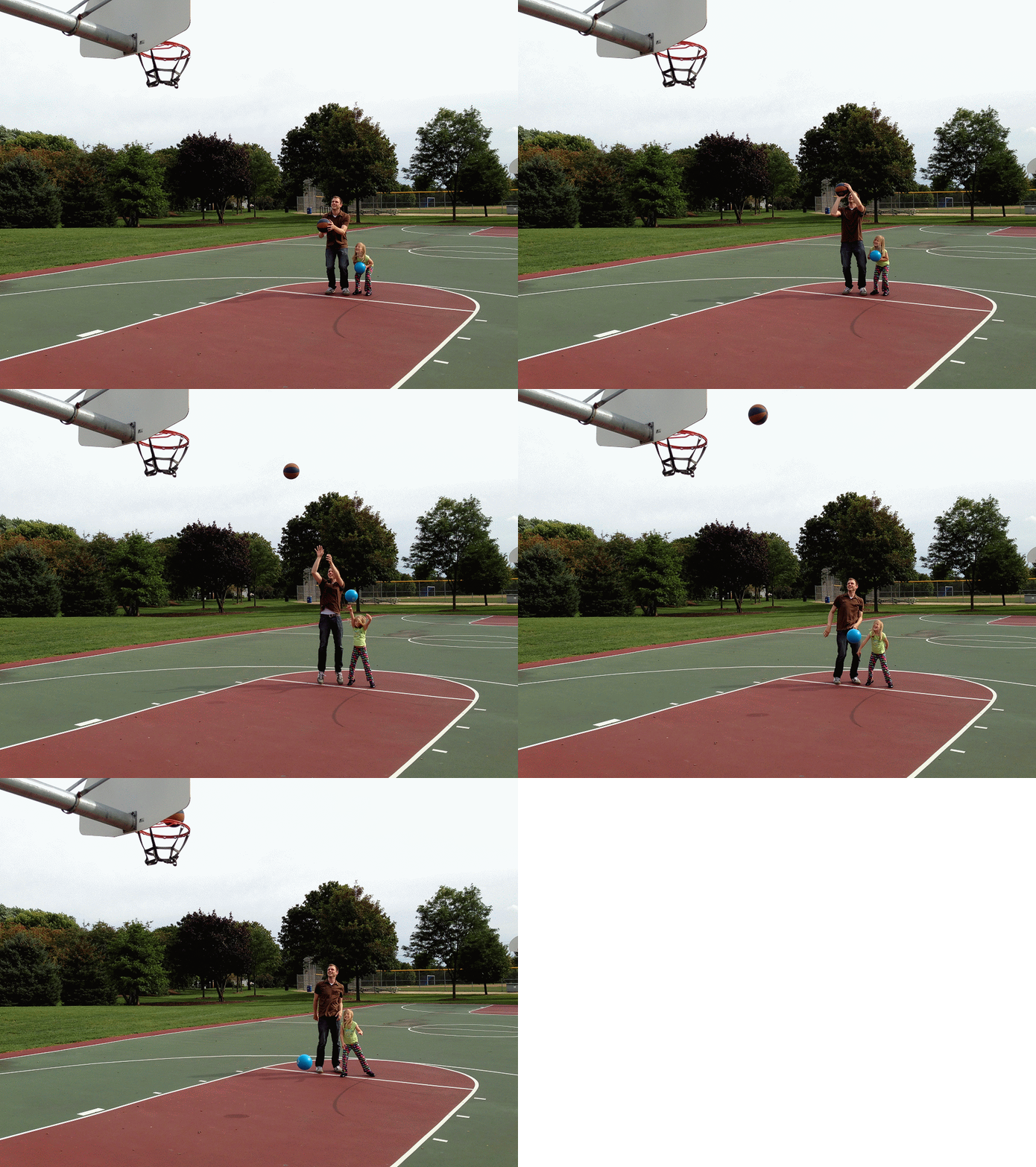
I was already satisfied, and then Google Photos did something I didn’t expect. When I synced my tens of thousands of photos, the Google Photos “Assistant” bot worked behind the scenes to breathe new life into them, by automatically compiling them into animations, stories, and collages. The stories and collages were roughly what you’d expect a computer to achieve when laying out photos: a fine enough job, but not too mind-blowing. It was the animation idea that knocked my socks off.
As any parent of a young child (who just WON’T SIT STILL) can tell you, you often need to take 30 photos in a row to get one good one. So we do that a lot. This means our photo libraries are cluttered with countless batches of photos, most of which are basically blurry garbage. Who has the time to go through all of them to find that one perfect gem? Definitely not parents of young children!
Google’s engineers realized this, so they transformed all that garbage into something great.

Now that, right there, is DELIGHT.
Not only did this feature make amazing use of all those junky photos I haven’t looked at in years, it did so automatically. Google Photos just made my entire library much better without my intervention.
This feature has been around for a couple of years, but it doesn’t show off its true power until you backload your 10 years’ worth of stuff. And before now, backloading all your stuff sounded rather unappealing since the Photos feature was deeply intertwined with a big social network.
It took Google a long time to find the special recipe — that perfect combination of features, capabilities, and surprises — to get DELIGHT. To make it happen, they needed to mix cheap storage, tons of processing power, robust file syncing, plus a healthy dose of smart thinking and a willingness to decouple Photos from its social networking parent.
Now, DELIGHT isn’t really about the software itself. Seeing photos of your kid from 3 years ago in a brand new way is sentimental and emotional. It just so happens that the software helped make those emotions happen. I love my kid, not the software, but now I’m certainly more endeared to the software and the people who created it.
This is what product design is about. Finding the special recipe for DELIGHT. Making people badasses by giving them new superpowers they couldn’t have achieved on their own. Everything else along the way — the animations, the copywriting, the tech, etc. — is just supporting material for the main act.
This was originally posted on Signal vs. Noise.
Want to get new posts by email?
Subscribe to my newsletter: