Why I love ugly, messy interfaces — and you probably do too
April 6, 2016
April 6, 2016
Beautiful. Fresh. Clean. Simple. Minimal. These words have been dominating design discourse for a while now. In case you’ve managed to miss them, check out this review of portfolio websites over on Creativebloq. The word beautiful is used 6 times, and simple 11 times. In one article.
Designers use these words to describe their values, goals, and results. They plaster their portfolios and resumés with them. Non-designers use them too. They’re everywhere.
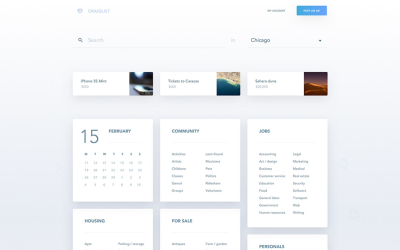
If you’ve hitched a ride on this wagon, you might have a website that looks something like this:
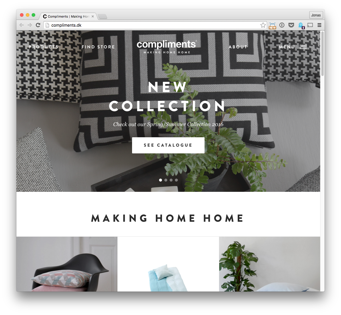
Lovely designs like this have become so commonplace that beautiful and clean are almost baseline constraints for new projects. It’s like every designer had the same Pinterest coffeeshop fever dream, and decided the whole world had to become lifestyle-chic.
And that makes sense, really! Everyone likes easily digestible things that look bright and stylish. Nobody wants ugly, messy stuff.
Or do they?
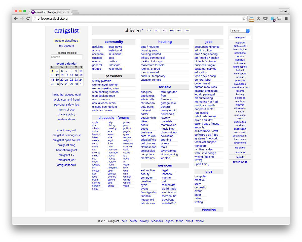
So…wait. If beautiful, fresh, clean, and simple are so important, why hasn’t someone upended all of these products with something nicer? It’s not for a lack of trying. There are countless simpler, better-looking Craigslist and Photoshop competitors, for example.
The answer is that these products do an incredible job of solving their users’ problems, and their complex interfaces are a key reason for their success.
Let’s say your goal is to make a global peer-to-peer commerce network. That’s a big, complicated project to tackle.
You could attempt to reduce your solution down to a minimal version, cutting out features and reducing density in the name of beauty and simplicity. Here’s a Craigslist redesign concept like that. (Designers sure hate Craigslist, don’t they? Has any other site had more unsolicited redesigns?)
Or, you might decide that you really can’t cut features, because it’s more important to nail every use case you care about. (Remember, you have to support a huge number of scenarios to reach table stakes for this project.) Now beauty and simplicity are instantly a much lower priority. Making something useful comes first.
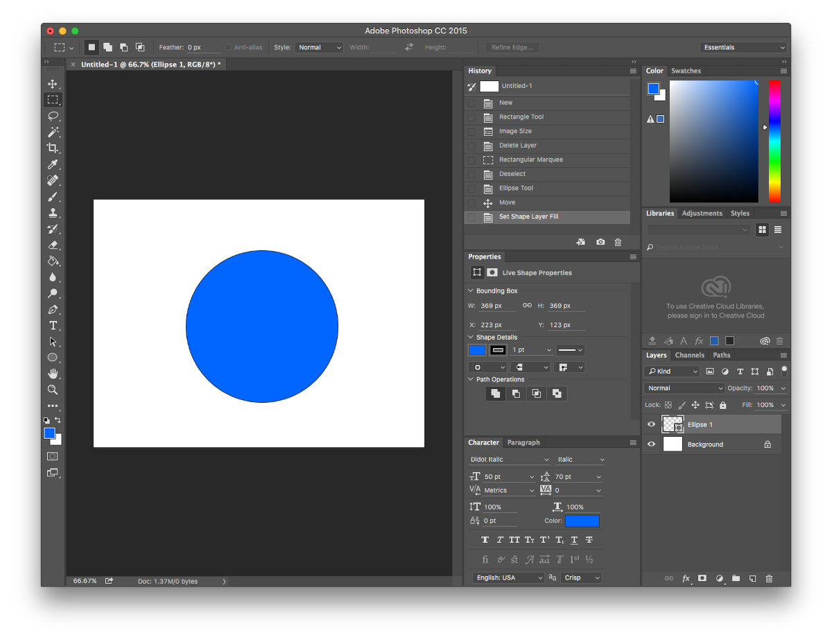
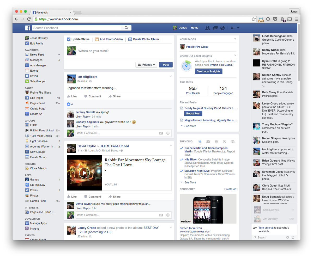
For another example, think of Photoshop. How many graphic designers who idolize Swiss Style also use Photoshop every day? Probably most of them. Yet Photoshop’s UI is the antithesis of minimal — it has more nasty junk drawers than your parents’ unkempt basement. It doesn’t matter at all, because people don’t come to Photoshop for inspirational UI. They use it to get the job done.
In other words, sometimes this isn’t so great:
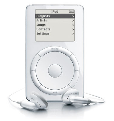
When this is what you really need:

Now, obviously I’m not suggesting you should go clutter up your design work, or make it look crappy on purpose. I’m also not suggesting that the examples above couldn’t be improved.
My point is: there is no single right way to do things. There’s no reason to assume that having a lot of links or text on a page, or a dense UI, or a sparse aesthetic is fundamentally bad — those might be fine choices for the problem at hand. Especially if it’s a big, hairy problem.
Products that solve big, hairy problems are life savers. I love using these products because they work so damn well. Sure they’re kind of a sprawling mess. That’s exactly why they work!
We needn’t all pray at the beautiful minimalist design altar. Design doesn’t have to be precious. Toss out your assumptions and build what works best.
This was originally posted on Signal vs. Noise. Adapted from a talk I gave at_ University of Illinois Webcon_.
Want to get new posts by email?
Subscribe to my newsletter: