Let’s stop trivializing design work
May 12, 2016
May 12, 2016
This week, Instagram updated their logo, and right on cue, the Internet exploded about it. This is not a post about that. Rather, this is a post about how we all critique design in public.
For example, this tweet got a lot of traction, especially from designy people:
Behind the scenes on the new Instagram logo pic.twitter.com/WPld3t0rJF
— Cody Sanfilippo (@codysanfilippo) May 11, 2016
And rightfully so…it’s a funny GIF. Anything with that thumbs up kid is gold!
There’s just one problem. Jokes like this spread the misconception that design is an easy and shallow aesthetic exercise. This seems to happen every time a major brand redesigns.
In case you’ve never made an app icon, here’s what it takes. (I just did this recently for my app Hello Weather.)
You need to:
Preferably it should also be flexible enough to reduce to a simple black and white glyph as needed.
Did I mention it needs to scale up and down and be semi-legible from 16x16 to 512x512? An app icon is not just one icon. It’s all of these icons:
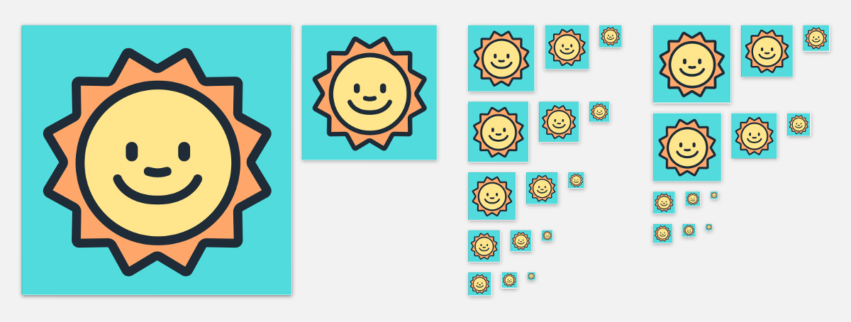
Oh by the way, you have just one tiny square in which to cram all those requirements.
So making an icon is trickier than it appears, and there are a lot of constraints to consider. A company as smart and design-minded as Instagram didn’t just crack open Illustrator and hack together an icon in 20 minutes — they probably designed and tested dozens of variations for weeks or months before choosing the final one.
Choosing is tough too. Let’s say you end up with 2 or 3 versions you like. There’s no way to know which one is right, but no matter what you pick, loads of people will tell you it’s wrong. An alarming number of people have the free time to tell you that they “don’t care for red” or any number of other equally inane comments.
It takes bravery and some pretty thick skin to launch stuff like this. Maybe it’s best to hide in a bunker for the week.

Overall, making an app icon is still a heck of a lot easier than landing a rocket on a boat in the ocean or the millions of things in life that are really truly difficult. But it’s not child’s play, either.
That’s why everyone has an app idea but only a small handful of people actually make apps: it’s hard to do, and even harder to do well. As designers who intend to be taken seriously (and paid well) for their efforts, we should acknowledge that and talk about it more often.
A good start is to change how you react to new design work in public. When people make big changes or launch new stuff, applaud them, support them, share positive comments or thoughtful critiques. Lead by example. That’s what you’d want them to do for you.
Want to get new posts by email?
Subscribe to my newsletter: