Reviewing the Safari redesign in iOS 15
An overview of the changes, some theories on the project’s goals, and thoughts on how it's working so far.
August 8, 2021
An overview of the changes, some theories on the project’s goals, and thoughts on how it's working so far.
August 8, 2021
I've been running the iOS 15 beta releases on my iPhone, and the most noticeable change is a major redesign of the core UI in Safari. Apple has been iterating on this in the open, so I thought it might be fun to write up a little critique, as if I was working on this feature and trying to decide if it's production-ready or not.
Note: this post is about iOS 15 beta 4. It will probably be out of date after more betas ship.
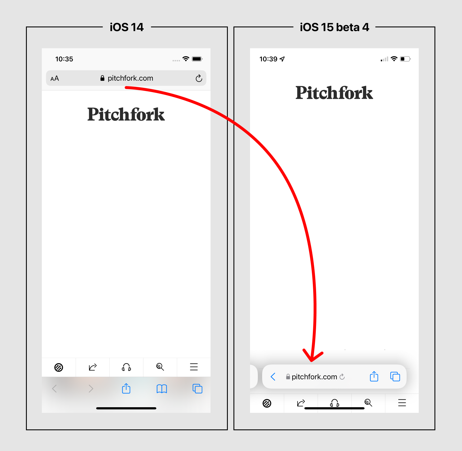
Here's a side-by-side comparison of Safari in iOS 14 and in iOS 15 beta 4, using Pitchfork as an example website with the content mostly blocked out, so you can see the differences. Pitchfork has its own bottom-oriented menu which gets into the mix here.

The summary of changes is as follows:
There are a few direct benefits to the new design:
There are also several downsides:
I'm all for experimenting with new ways to tackle an old UI problem. You'll never know if you can find a better design unless you try.
When you're redesigning something as fundamental as browser UI, you have to start with a strong opinion about what you're trying to improve. It's tough to beat time-tested, production software that everyone is used to, so you have to define what aspects you think could be better, and explore new designs with those targets in mind.
We don't know what Apple's priorities are, but it seems like they're trying to optimize for three things:
Let's assess how well this new design hits the mark.
Reachability is improved for accessing Safari's URL input, but this also has a detrimental side effect on the reachability of website content. Website menus and navigational elements are often positioned up at the top of the screen. Top-oriented browser chrome helps push those elements vertically lower, so they're easier to reach. Without any browser chrome at the top, content is even further away from your hand, and thus harder to reach.
This is a significant drawback because 80% of the time in a browser, you're interacting with websites, not the web browser's UI itself. As a result, the overall reachability benefits of the new design are mixed.
Space saving is one of those designery goals that's often more rooted in extreme minimalism than in actual real-world use cases. I'd guess that no customer has ever complained about the space Safari's UI used up in iOS versions 1-14, because that space was occupied by several useful buttons and inputs, and it wasn't too much space anyway. It worked fine, and most people just don't care about this.
But as a designer, it's a worthy principle to let content be the star of the show as much as you can. If it's possible to get away with less browser chrome, and to have simpler interface, why not give it a shot?
So let's imagine we're giving it a shot. A great way to start is by collecting all of the various UI elements, and combining them into one place. This is like organizing your socks by putting them all together in one pile, and then figuring out how to subdivide after that.
That's what Apple has done here. Two distinct toolbars have merged into one toolbar.

The designer’s reason to do this is to aggressively oversimplify — cut out almost all the UI — and then make each individual affordance fight for its reintroduction to a prominent placement. This is an iterative process of paring everything back to the barest essentials, and then gradually reintroducing features that prove themselves to be so vital that they're too annoying to have tucked away in a secondary location.
As you can see in those screenshots, several buttons have been moved into the Share and Tabs submenus, rather than being prominently accessible all the time. Reader mode and Bookmarks didn't make the cut. The Reload button is now much smaller, and the Forward button only appears conditionally.
Uniqueness is also a designer goal that doesn't have an immediately obvious end-user impact, but it can have a lot of upside over time. If Apple decides to run with this new UI, Safari will have a standout interface that looks nothing like any other mobile web browser. That means it'll be easier to tell Safari apart from the others.
If Apple gets it right, they'll lead the industry with something new and weird, and other browser makers will likely end up following suit. This will subsequently affect how mobile website creators design their sites. And new innovations will also find their way into this bottom-oriented UI ecosystem over time.
All of this is why it’s worthwhile to try redesigning "solved problems" like browser UI. In the end, you might arrive somewhere better—or at least somewhere different.
It depends on how you measure success. Based on our goals listed above, the new design is probably successful enough: it’s (somewhat) reachable, space saving, and unique.
But is it a significantly better experience overall?
So far, not really.
Generally, software is easier to use when affordances are prominent and visible, rather than buried away in submenus. Of course, you can’t make everything prominent and visible because there’s only so much space, so you have to prioritize things. There are three main choices for every input or button you need to include:
CLEAR AND OBVIOUS: The affordance is visible and prominent, and it has an icon and textual label describing its function.
OBVIOUS, BUT NOT CLEAR: The affordance is visible, but it has an icon without a text label, so users have to guess what the icon means.
CLEAR, BUT NOT OBVIOUS: The affordance is minimized or hidden in submenus. Users have to hunt around or guess where to find it, but once they find it, it's clearly labeled.
In complex software there are lots of affordances to organize, so you usually end up doing all three of these. The overall goal is to make the essentials as obvious and clear as you can, and then tuck away the more esoteric or less-frequently-used options.
With the Safari redesign, Apple has demoted several buttons into the NOT OBVIOUS category, and the ones that remain are all packed together. There are now at least five different affordances in that one small bar, which feels crowded and a bit unresolved. Some features, like private tabs, are deeply buried and probably don’t need to be.
In total, the new design still has more day-to-day friction than the old version it replaces. But it's not too far off, and Apple might decide that some increased friction is worth the tradeoff for all the other benefits outlined above.
This depends on how committed the team is to the floating URL bar design. If they've locked on to this concept, all that's left is optimizing and polishing it as much as possible. No matter what, the floating bar is always going to feel a little clunky or crammed, because you simply can’t pack much more into one horizontal bar.
Whenever I'm feeling space-constrained in a design, I start questioning why we've backed ourselves into a situation where we don't have enough space to work with. So if the team still has time to try something else, I would suggest relenting on the ultra-minimal bar and explore other designs that would allow for more flexibility again.
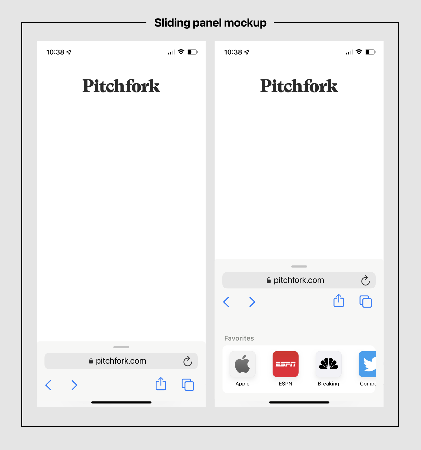
For example, they might try something that works more like the Maps app's sliding bottom panel. With that pattern, you could keep most of the minimalism and reachability benefits of the floating bar, but with a lot more room for quickly showing secondary options.
Here's a rough mockup showing how that could look:

This is less minimal for sure, but also a bit more obvious and not as space-constrained. The challenge with this design would be how to present the tab management UI (should it go underneath the sliding panel, inside of it, or on top?)
Edit: Matt Birchler also had this thought and mocked up a nice variation too!
Anyway, I hope you enjoyed this little armchair design critique. It's difficult to change this sort of thing, especially when you're designing out in the open and getting tons of feedback from all over (especially rando designers writing on their blogs. 😅) Looking forward to seeing the final solution.
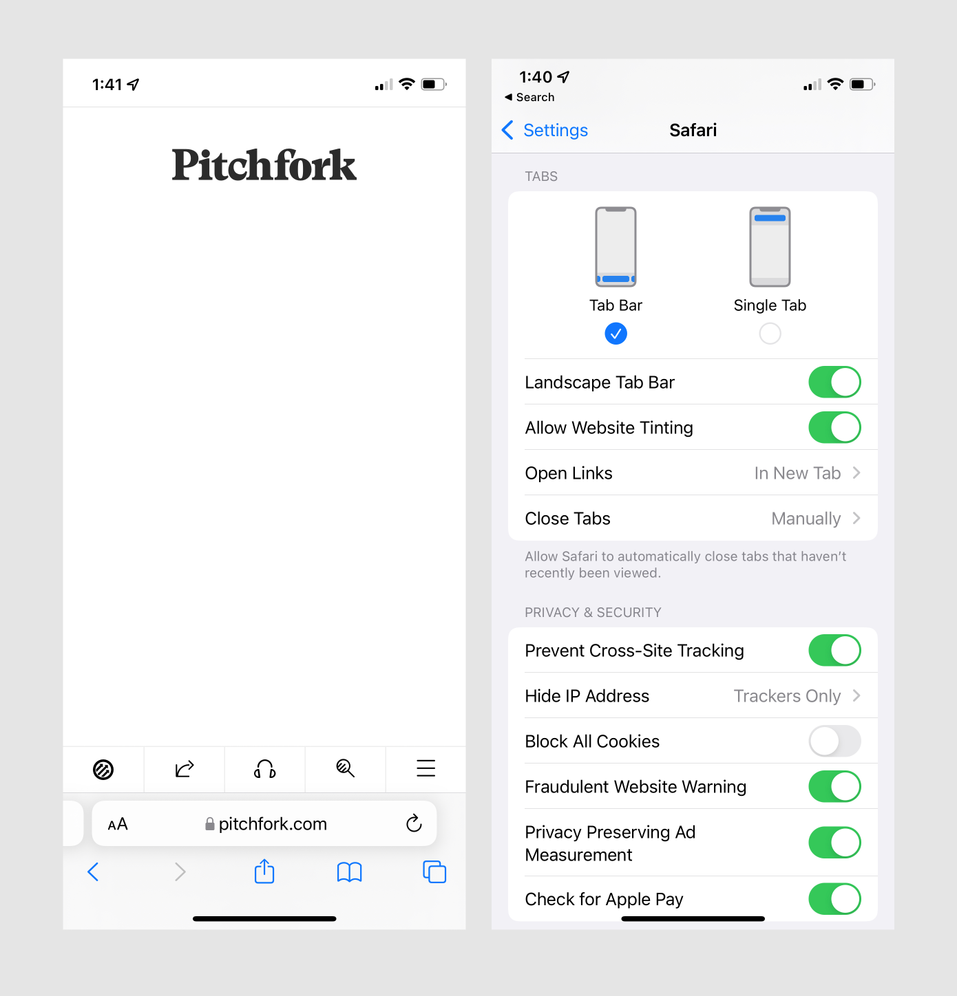
In iOS 15 beta 6, Apple shipped a new version of this interface that’s much closer to my mockup above. They also added an option to switch back to having a top-oriented URL bar if you prefer that.

I’ve been using this for a day, and it feels like a good compromise between the original iOS 14 design and the new floating URL bar concept. You might argue that designing in the open scared Apple’s designers from taking a bigger risk, but I think the feedback led to a much less jarring, more usable variation that still accomplishes all the goals above. It’s a great example of taking feedback and polishing an idea to be production-ready.
Want to get new posts by email?
Subscribe to my newsletter: