The eternal challenge of making one UI do two things
As demonstrated by the subtly complicated “checkbutton.”
August 18, 2021
As demonstrated by the subtly complicated “checkbutton.”
August 18, 2021
Recently Twitter launched a nice design refresh, and one of the changes was particularly controversial. The Follow button's styling was visually reversed from its previous design:
I’m convinced this was a mistake because I don’t think anyone would intentionally do something like this. It’s like turning on the lights when they are off. Obviously makes no sense. I bet it will be fixed ASAP.
— Rasmus Andersson (@rsms) August 15, 2021
[Before vs after:] pic.twitter.com/g6mY9ukTvV
On the surface this just looks like a styling change, but there’s a related bit of complexity lurking here that I wanted to point out…
Buttons that also show a status are always difficult to get right.
Why is this?
Most of the time a button is a one-way action. You see a button, you click it to do the thing it says, and you’re done. Here’s an example from ye olde days:
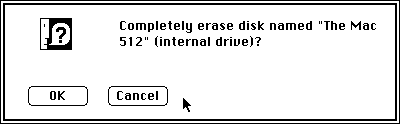
There’s no question what’s going on there. Either you’re OK with this or you Cancel. Regardless of which option you pick, this dialog and the buttons go away entirely, and you’re done with this decision.
By contrast, when a button represents the state of data stored in a system (like whether you’re following someone on Twitter or not) it’s also doing the work of a checkbox — turning a binary flag on or off — and submitting the change simultaneously.
So, what you really have is a checkbox and a submit button munged together. A fully extrapolated version of this UI might look like so:
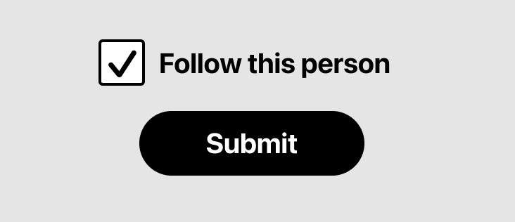
Obviously, this takes up a lot more space than a single button, which is why designers end up making the compressed version.
I’m not sure if there’s a name for a munged checkbox-button, so I'm just going to call it a CHECKBUTTON.
There’s no universally accepted design pattern for checkbuttons, so there’s no perfectly right or wrong way to go about making one. Here are a bunch of examples of how one might design the two states of a Follow checkbutton:
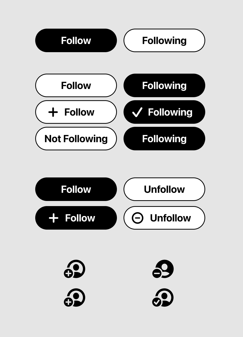
Notice that you can style these however you want!
Furthermore, the language is not really ideal in any of them. “Following” isn’t an action word, it just explains the state. You have to infer that clicking the button will unfollow.
But “Unfollow” has a negative connotation that isn’t great either. Imagine clicking Follow and then having the button immediately say Unfollow. Sure it’s an accurate explanation of what will happen, but it’s also a little harsh, since you just made the choice to follow. And of course, any platform wants to encourage you to follow, not unfollow people.
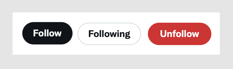
Either word choice is a slight compromise, which is probably why the web version of Twitter has a THIRD state that says Unfollow when you hover the button:
This all gets even more complicated when you’re working with a design system. Design systems usually have a notion of primary and secondary button styles, which help differentiate the main actions on a screen from supplemental ones. The primary button style is more visually dominant.
With a checkbutton, you have to figure out how to map these styles onto the state of the data. Should it be…
ON=PRIMARY OFF=SECONDARY
or
ON=SECONDARY OFF=PRIMARY
???
The styling you choose depends on: 1) the button’s default state (on or off), 2) whether this is an action you want to visually emphasize, and 3) all the other buttons you have to contend with on the same screen. The choices are subjective and context-specific.
In Twitter’s case, the controversy over the change was due to swapping the styles people were already used to. Dann Petty shared an excellent explanation of how the new styling changes make sense when you look at them holistically, and in context with other buttons in the app.
In conclusion, designing checkbuttons is as clear as mud. I’ve personally been tripped up designing these at least half a dozen times. They almost always end up causing an internal design debate over the styling and word choices, so it’s not surprising to see this cause a stir in public too.
Have you seen any particularly good examples of a checkbutton? Hit me up on Twitter or by email and I’ll tack them on to this post.
Want to get new posts by email?
Subscribe to my newsletter: